*image by cuidevices.com
So we talk a lot about peaks, drops, and other problems in frequencies, we all love to look at graphs to prove our points, or say things like thin, warm, muffled. But what do those frequencies and terms actually mean?
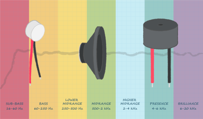
Very simply said, the established frequency range that we can hear is 20 Hz to 20.000 Hz (or 20 kHz). We divide this into subsets so we can better talk about sound.
The most commonly used subsets and terms are as followed:
- 16-60 Hz – Sub-bass, This is the low musical range, its very bass heavy, only a few instruments like a bass guitar or tuba enter this range.
- To much of this will result in a overly powerfull and covering sound
- 60-250 Hz – Bass, This is were most heavy/fat instruments live.
- We mostly use the term warm or cold here, to talk about pressence of base
- 250-500 Hz – Low midrange, a lot of brass instruments live here.
- To much of this can make the sound feel muffled or muddy.
- 500-2000 Hz – Midrange, Most of the band is here.
- 2-4 khz – Upper midranage, Human ears are very sensitive to this part. The high midrange is mainly responsible for the attack on percussion and rythm instruments.
- To much of this, can quickly cause listening fatigue.
- 4-6 kHz – Presence – Higher harmonics and treble often are found here.
- Overboosting this can cause, irritating harsh sounds.
- 6- 20 kHz – Brilliance – The far end of sound is often used for whines of whistles. Think about pronouncing an ‘s’, certain percussive sounds like symbals also make this range.
- To much of this can causes hisses and have major effects on ear fatigue.
So a bit more about terms
Every community has its own terms to describe things, some are common like warmth or sharpness. But is not surprising if you find new terms when you look at another reviewer or community.
Frequency response graphs
To display the characteristics we can measure them and display them with graphs, for an example lets look at the referee of sound the HD600.
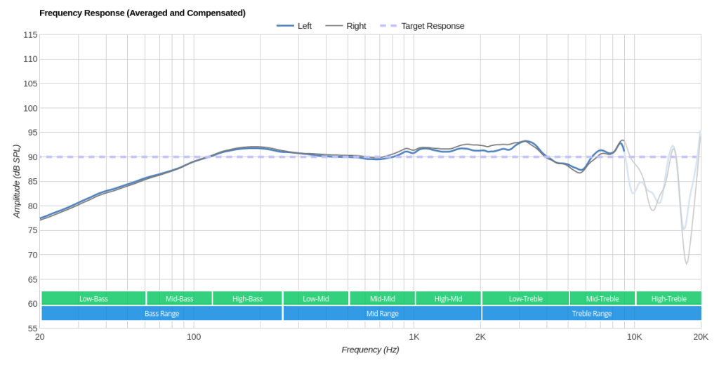
This is the most common form of a graph, if you look at the top it says “Averaged and Compensated”. What the graph looks like totally depends on the curve it is measured against. In this case, it is a raw graph that is compensated against its own curve.
A common curve is the Harman target curve. This target was developed by Harman Research to best identify what kind of tuning people prefer.
So let’s have a look at that graph. The HD600 is famous for being “flat”, yet we see a lot of roll off and the start and the end. So let’s look at the lower frequencies first. A lot of people prefer a more warm sound, so a lot of curves take this into consideration. So compared to the curve it is compensated it has relative “weak” low bass. For the high end, it is important that we look at the range. You can see that most of the graph goes up to 10k and then the rest is all in that last shaky part. So a lot more differences can happen to hear and even tho we are very sensitive to the sounds there not a lot of instruments actually produce sound in that range. So it is less important overall.